UvicSchedule - Formal Proposal and Prototyping
UvicSchedule ApplicationTeam: Dragon Squad
Team Members: Kevin D., Ryan G., Ian S.
Proposal
The UVicSchedule application will provide an easy and intuitive way for a user to create and maintain their course schedule, view their schedule offline, and compare their schedule with friends.
Current Problem
The UVic web interface for course scheduling (and in general) is atrocious. The interface is archaic and unintuitive, with poor support for common browser features like tabs and the back button. The experience is even worse on mobile, with tiny, cluttered buttons and no support for sideways scrolling or zooming, making certain features impossible to use. Almost everyone who uses the system either prints out a copy of their weekly schedule or keeps some kind of offline copy on their phone in order to avoid using the UVic website. Many users report that it takes a week or more to schedule courses through the UVic system, noting that the only positive thing to be said about it is that it is better than lining up at the registrar's office.
How Will UVicSchedule Fix That?
The UVicSchedule app will provide an offline schedule as well as an improved course searching interface so that people can track their schedule without a headache, and sign up for the courses that they want without hassle. Not only will it have a cleaner searching interface, it will include options to exclude courses that conflict with your current schedule so that building a schedule is easy. It will include sharing features so that saving or printing your schedule is easy, and sending your schedule to friends is convenient. Through interviews, it was found that many users copy their schedule to Google Calendar, so convenient exporting functionality will be included as a feature. If you need to compare your schedule with your friends, you can overlay multiple schedules by simply selecting your multiple saved schedules and instantly see when you and your friends each have a break.
Required Tech
The UVicSchedule app will need to interface with the UVic course database somehow, either by scraping, or with UVic's permission.
Conceptual Design
An affinity diagram was created as a conceptual model in order to map out the hypothetical functionality of the UVicSchedule application. The diagram was designed around three user tasks.
User Tasks
The following scenarios were chosen because the primary features of the app are searching for and adding courses, comparing timetables to friends, and making it easy for the user to track their UVic schedule. These three scenarios will give a good idea of the breadth of functions provided by the UVicSchedule app.
Task #1: Adding a Course| User Input | System Response |
|---|---|
| Shosh'anna opens the app | Display main menu. |
| Shosh'anna clicks the "add courses" button | Display course search menu. |
| Shosh'anna enters "SENG" in the search box, checks the boxes for "don't display conflicting courses" and "only display courses I qualify for" and then presses enter | Display search results. |
| Shosh'anna finds the course she wants, and presses the "add course" button | Display schedule with an overlay showing how the different blocks of the course fit into her schedule, and allowing her to choose a block. |
| Shosh'anna picks the block she wants | Display any tutorials or labs associated with the class in a similar overlay interface. |
| Shosh'anna picks her lab slot | Class is added to schedule, schedule page displayed. |
Task #2: Comparing Schedules
| User Input | System Response |
|---|---|
| Abborgale navigates to the weekly schedule page | Display Abborgale's weekly schedule. |
| Abborgale opens the schedule selection drop down | Display a list of people who have shared their schedules with Abborgale. |
| Abborgale selects Darnell (his own schedule is already selected by default) and presses OK | Display Abborgale's and Darnell's schedules overlapped. |
Task #3: Syncing with Google Calendar
| User Input | System Response |
|---|---|
| Abborgale navigates to weekly schedule | Show Abborgale's weekly schedule. |
| Abborgale presses the "share" button | Show list of sharing options and other apps to open. |
| Abborgale presses "sync with google calendar" | Prompt Abborgale to provide google login. |
| Abborgale enters google login | Calendar will now sync with Google whenever it has changed and the user is connected. Display "synced with google calendar". |
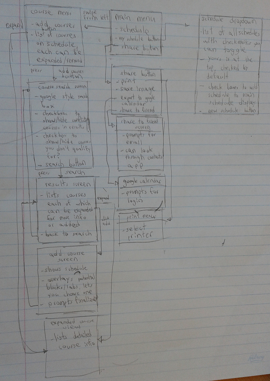
Affinity Diagram
The following image displays the final affinity diagram that was used to create three individual paper prototypes of the application.
Individual Prototypes
Three paper prototypes were completed individually in complete isolation from one another in order to maintain a flow of free, unfiltered, and exclusive thought. Starting with a common ancestor, the affinity diagram, each prototype branched off in its own unique evolutionary path. A path guided and limited only by the logic and fantasy of its creator's own supple mind.
Prototype #1 (Created by Ryan G.)
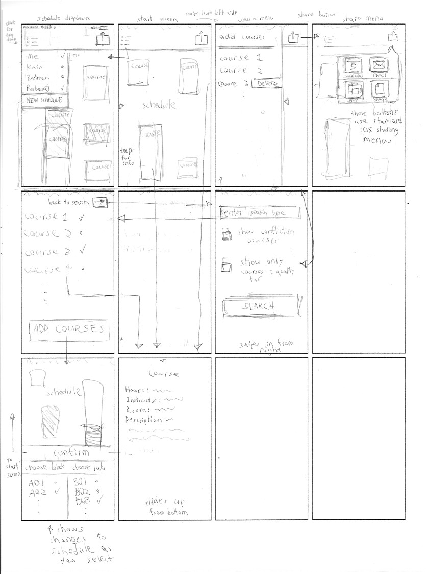
"For my paper prototype, I decided to lay out the views of the application in a landscape format. I knew right from the start that conveying an entire week of scheduled classes would require a large amount of screen real estate. I know from personal experience that a lot can happen in a week, and I am not willing to limit my schedule to the narrow confines of a portrait format. With a landscape format, the timetable and menus can be viewed alongside one another (visibility). Menus can be pulled out from the left and right by swiping in those directions respectively (mapping). Serious actions such as adding or deleting courses display confirmations that the action has successfully completed (feedback)." - Ryan G.

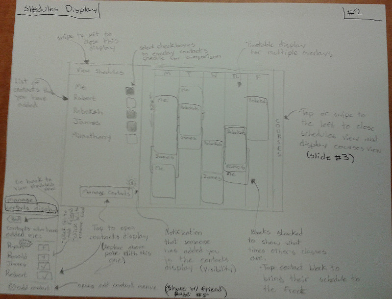
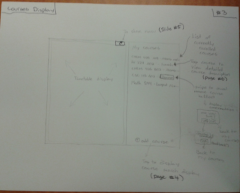
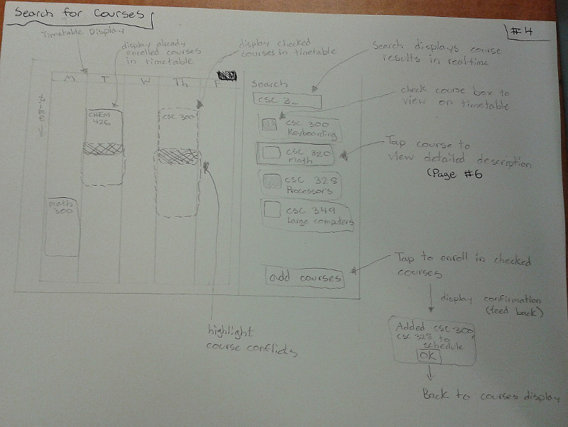
Prototype #2 (Created by Ian S.)
"Visibility. This design does the best that it can to make the schedule visible
while still making the functions of each page accessible. Wherever there is a page that
swipes in from the side I make sure to indicate where and how the user can swipe with a
small arrow.
Feedback. I tried to incorporate feedback in the course addition menu, when you have
selected a course to add it shows you where the various blocks fit on your schedule
and allows you to pick which block and lab you want accordingly.
Constraints. I limit the possible interactions by using slide in windows that only
allow the currently available actions to be visible at any given moment.
Mapping. I use established conventions of the iOS environment when designing the
various menus, controls and lists in my design. The method of swiping a list item
to the left to show its delete button is a common feature of iOS. The buttons that
I use for the share menu and course list are buttons that are common in iOS apps,
so that if the user is already familiar with the UI of their iPhone, they will be
familiar with this app.
Consistency. The arrows on the edge of the screen always indicate a swipe and indicate
the direction of that swipe. The schedule list and share button follow established iOS
functionality, and clicking on a course's name always leads to that course's description page.
Affordance. The lists provide scrolling, as expected of lists, the arrows provide swiping,
and everything that looks like a button can be pressed, from menu icons to course blocks to
list entries." - Ian S.
Prototype #3 (Created by Kevin D.)
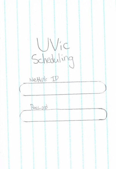
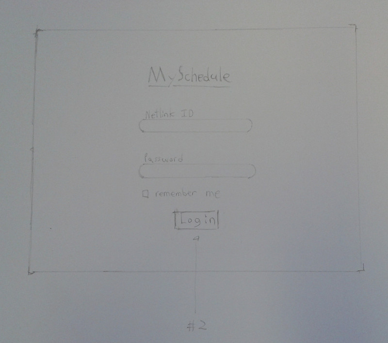
Login Screen
This is the first page the user is presented with, featuring a prominent logo, and two clearly labelled text fields.
The design makes the assumption that the user is familiar with pressing enter on their phone keyboard to submit a form. This practice is quite common, even on phones.
Overall Design Choices
Because of the small target screen size, this design makes use of icons for many functions. Effort was taken to choose very recognizable symbols. Buttons are labelled when icons would not be appropriate. Because English literacy is required for enrollment at UVic, there is no need for additional language support.
Interface elements are generally rounded in appearance, to give a smooth, relaxed look to the application. The design would make use of the UVic website's deep blue colour in the header and any bottom action bars, and otherwise favour a relatively colour-neutral design, for accessibility reasons. Additionally, drop shadows would be employed to denote the hierarchy of elements, with important elements such as the header bar casting a shadow on the views beneath.
To reduce clutter, whenever an interface element appears over the rest of the interface, as with the Course Detail View, the rest of the app is darkened. This makes it clear that the user should be acting upon the displayed element.
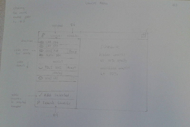
Header Bar
With the exception of the login screen, the app is clearly split into three distinct pages, denoted by the three icon tabs up top: an eye for viewing the schedule, a magnifying glass for course searching, and two silhouettes for sharing. Additionally, there is a gear icon on the right, which brings up a standard list of settings, using the style of whichever OS the app is installed on. A tabbed format allows the user to quickly switch between important tasks without navigating a hierarchical view.
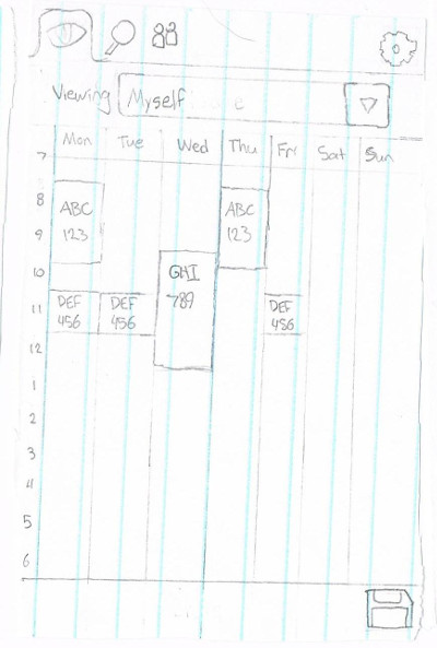
Schedule
This screen presents a weekly timetable for the user, and is the default page of the app. Courses can be tapped to bring up a small details dialogue. The dropdown menu at the top brings up the schedule selector, and the floppy disc icon in the bottom right can be used to save a picture of the schedule.
Clear labelling of courses, dates, and times should quickly make it obvious that this is a schedule.
In retrospect, this design lacks a means of changing the time being viewed. Because some courses last for only part of a term, and the user might wish to view upcoming or previous terms, this is a crucial oversight.
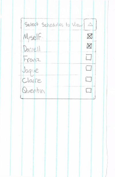
Schedule: Schedule Selector
This menu is accessed from the Schedule Screen. It presents a checklist of names, for the people who have shared their schedules with the user. Any number may be selected, and when the view is dismissed (either by pressing the top segment of the dropdown, or by pressing outside of the menu), the user will be shown the Multiple Schedule View.
While most users should be familiar with the notion of a dropdown menu, it is not common for a dropdown to also be a checklist. This is very functional, but may not be entirely clear, and would benefit from an "OK" or "Select" button to confirm and dismiss the dialog.
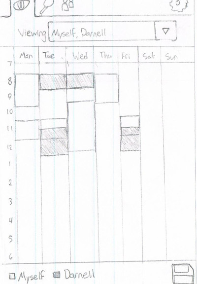
Schedule: Multiple Schedules
This is a mode of the Schedule View, for when the user has multiple schedules selected. Schedules appear overlapped, and are colour coded by person, with a legend at the bottom of the screen.
To prevent clutter, course names are not shown while in this mode. However, courses may still be pressed to view details. This mode would benefit from an additional dialogue which appears when the user could have pressed one of several courses, to let them specify which course to view. It would be a simple list of items, from which the user would select one.
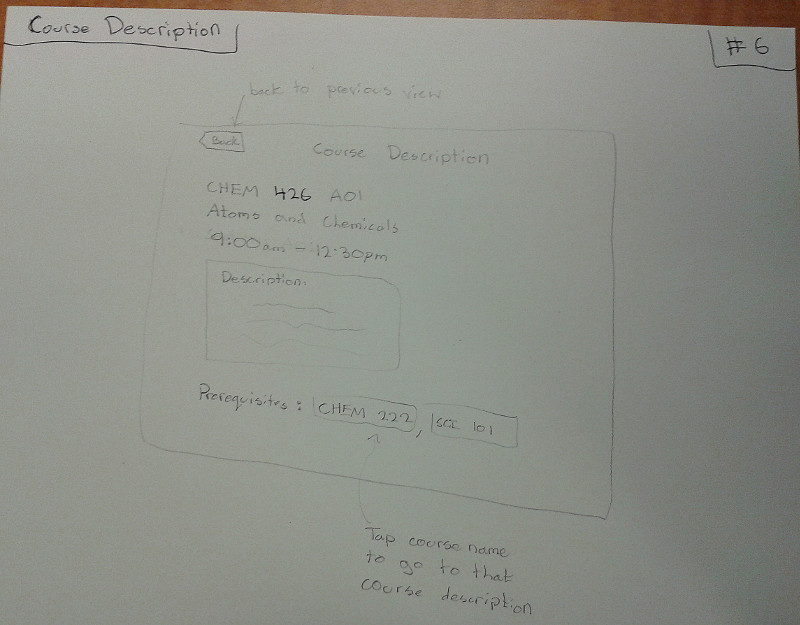
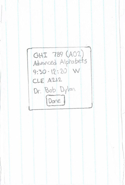
Schedule: Course Detail View
This dialog appears when a course is pressed in the Schedule Screen. It contains the kind of information that a user might want to know when trying to find the class, or when confirming the start or end time.
It is dismissed with the done button, or by pressing outside of the dialog.
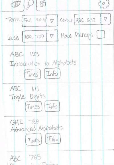
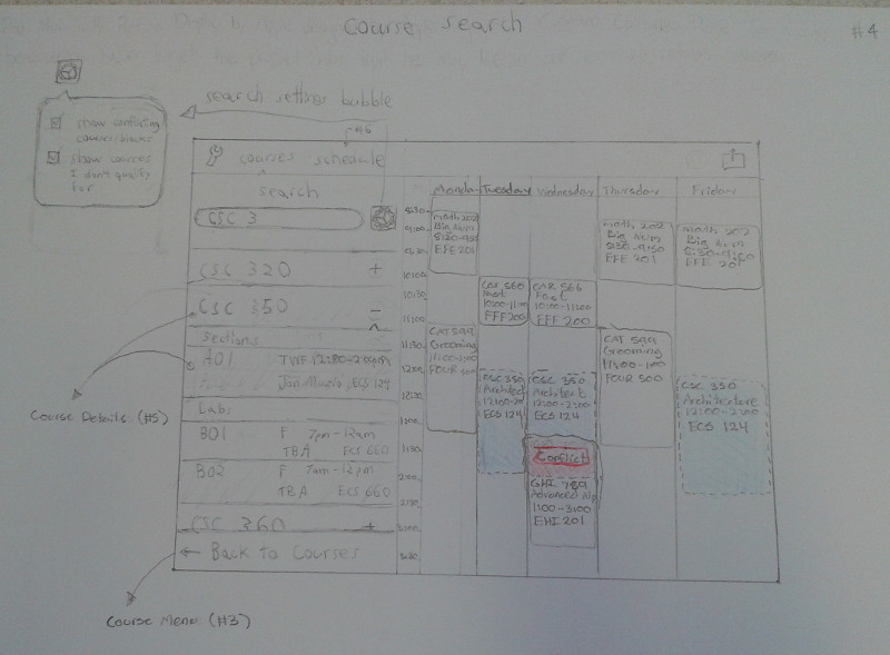
Course Search
This page is used to find courses, based on a set of criteria. At the top, the user can select which term they are searching, and specify the fields of study, and course levels, using a dropdown checklist like the Schedule Selector. Additionally, the user may choose to view only courses for which they are eligible.
A drop shadow would be cast from the filter options over the search results, to clearly distinguish the two elements.
Search results are displayed in a list, with the option to view scheduled times, and further information about the course. These are divided into clear blocks. Ideally, these blocks would take up slightly less than all of the screen, such that the next item is obscured. This would make it very obvious that the list is scrollable.
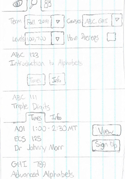
Course Search: Times/Info
When the user presses the "Times" button of one of the course search results, this element appears below the course, pushing down the rest of the list.
This is another list, but will scroll with the rest of the search results. The user can press the "View" button to see what their schedule would look like with this course added, and can press "Sign Up" to enrol.
The "Time" and "Info" buttons are treated like tabs, in that only one may be open at a time. However, they are closed when their button is pressed again, or if their respective course is pressed. This is to prevent excessive lengthening of the list.
To keep the interface hierarchy clear, the "Times" and "Info" tabs should not be made to appear on top of their respective course. This is again accomplished by having the course cast a shadow on them.
Pressing "Info" brings up the same type of element, which contains only details about the course.
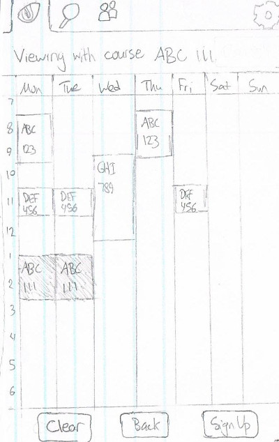
Schedule: Course Preview
This is another mode of the Schedule view, which is accessed when pressing "View" from the "Times" dialog of a search item. It shows the user's schedule as it would be if the selected course were added.
The new course is shown in a different colour, to clearly distinguish it from the others, and the bar at the top states that the user is viewing tentative schedule.
At the bottom, three buttons appear: "Clear", which returns to a normal Schedule view; "Back", which returns to the search results; and "Sign Up", which signs up for the course, as in the previous view.
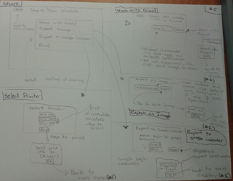
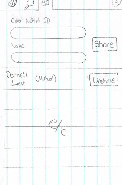
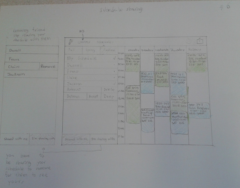
Sharing
Here, the user can manage whom they share their schedule with. The dialog at the top is used for sharing with others. This requires entering their Netlink ID, and a name for the app to refer to the person.
Below is a list of people that the user has shared their schedule with, displaying their name, Netlink ID, and the relationship between the users. If both users have shared with one another, it reads "Mutual". If the other user has not reciprocated, it reads "Has not shared". Vice versa, it reads "Is sharing". In this case, the "Unshare" button reads "Remove".
The "Unshare" button accompanying each other user makes the user's schedule unviewable by the other. The user will also no longer be able to view the other's schedule.
The social aspect of the app is very simple, so this interface is meant to be quick to use. To minimise hassle, the sharing mechanism is asymmetric. This means that a user can their schedule with a friend, and it will immediately be viewable .
Final Group Prototype
After a tough and brutal session of isolated design, each member of team Dragon Squad presented their prototypes, ideas, and dreams to each other in a non-threatening democratic environment. Countless hours of debate, constructive criticism, and iteration resulted in the ultimate prototype. A prototype worthy of the name 'Dragon Squad'.
Application Layout
The UVicSchedule application consists of six views:
1. Login
This view displays the initial login screen. The user must login to the application in order to pull their course information from UVic. The user uses their Netlink ID and password as credentials.
2. Main View
This view displays the user's timetable in a large format. The settings, courses, schedules, and export menus may be accessed from the top toolbar.

3. Course View
This view displays the user's courses in a list alongside their timetable. The user is able to hide courses, manage waitlisted courses, and add new courses. From this menu, the user can access the course search menu.
4. Course Search View
This views displays a real-time search menu alongside the user's timetable. The user can specify search criteria through a search setting menu. Courses matching the user's query are displayed in a list. Each course expands to show each lecture, tutorial, and lab section. The user is able to select sections and view what those sections would look like on their timetable.
5. Detailed Course View
This view displays detailed information about a course. This view is accessed when a user taps a course in either a course list or on his or her schedule. The user is able to add or drop the course from this view if one of those actions is relevant to the situation.

6. Schedule Sharing View
This view displays a list of contacts alongside the user's schedule. By selecting contacts, the user is able to view a contact's timetable overlaid on top of his or her timetable in order to compare schedules. The user is also able to manage their contacts from this menu.
Donald Norman's Principles of Design
Donald Norman introduced six core principles and concepts of design in his book "The Design of Everyday Things". Visibility, feedback, constraints, mapping, consistency, and affordance are crucial concepts for understanding usability and learnability in everyday objects. As proud supporters of Donald Norman, Team Dragon Squad tries its best to adhere to his principles, both publicly and privately.
1. Visibility
A landscape view was chosen in order to display menus and the user's timetable in the same screen. From any screen in the application, the user is able to see and access any menu. This provides visibility to the functions of the application.
2. Feedback
When a user performs an action in the app, you can sure bet that the user will see the results of that action shoved right in his or her face. When a user adds a course, they will see the timetable update in real time. In fact, the user will see any modifications to the timetable view in real time whether it be comparing schedules, hiding courses, or viewing alternate course sections.
3. Constraints
The user's interaction with other UVicSchedule app users is constrained to their contact list. The user is in charge of who they share their schedule with, and who gets to show up on their contact list.
4. Mapping
The concept of mapping is heavily used in the UVicSchedule app. Choice of icons were carefully selected in order to conform with Apple's iOS standards. This creates an intuitive mapping for users that are familiar with other iOS application.
5. Consistency
The schedule, courses, and course search view are consistent with each other. Each of the menus are displayed in the same orientation and size, are opened closed in the same way, and each is able to display real-time actions in the timetable view alongside the menu.
6. Affordance
The application uses buttons for when things should be tapped, lists for displaying details, plus symbol icons for adding elements, and textboxes for entering information. UI elements were chosen carefully to provide the actions that they afford.
Conclusion
Team Dragon Squad aims to help UVic students manage their day to day lives with their simple, intuitive, and streamlined UVicSchedule application. Every second that a student spends creating their course timetable is a precious second taken from their lives, never to be returned. A student that can reduce the time spent creating a timetable is a student that is able to focus on grabbing that next rung on the long ladder to success. And that is what Team Dragon Squad is truly about. Because a child born into a world free of the tedious scheduling process is a child born into a world where miracles are common place.