UvicSchedule Prototype Usability Study
UvicSchedule ApplicationTeam: Dragon Squad
Team Members: Kevin D., Ryan G., Ian S.
Introduction
UvicSchedule is a mobile application that hopes to improve Uvic’s MyPage course scheduling system. The application allows users to easily register for courses, share and compare their schedule with friend, and export their schedule to other applications such as Google Calendar and Facebook.
A usability study of the prototype was conducted in order to communicate with the target audience and evaluate certain aspects of the application.
Objectives
The objectives of the usability study were to test whether students found the UvicSchedule application intuitive, easy to use, learnable, and if they had any suggestions on improving the user interface of the. Another objective of the study was to find out if the application’s method of course registration was preferred over the current Uvic MyPage scheduler.
Method
The UvicSchedule application was tested by using the method of natural observation. Study participants were observed individually as they completed tasks within the applications. The participants were timed while completing tasks and also a record of how many taps/clicks were performed while completing each task was measured. After the participant completed all tasks, they were asked a questionnaire on certain aspects of the application.
Participants
The usability study involved seven current Uvic students, either gender, aged 18-26 years old. The participants were expected to have past experience with mobile devices and course registration using MyPage.
Tasks
Each subject was asked to perform three tasks using the application prototype and one task within the MyPage system. In order to measure learnability, the participants were asked to perform the tasks again a week later.
- Search and register for courses
- Compare schedule with a friend
- Export schedule to Google Calendar
- Search and register for courses using MyPage
Procedure
The following table describes the procedure of the usability study in detail.
| Step | Action |
|---|---|
| 1 | Describe the purpose of the UvicSchedule application to the user. Let the user know that the performance of the application is the subject of testing, not them. |
| 2 | Explain the the user that the application is a software prototype. Let the user know about the limitations of the prototype (user must tap text fields instead of typing). |
| 3 | Explain to the user that they will be asked to perform tasks within the application and within Uvic MyPage. Let the user know that they will perform additional tasks using the prototype in about a week. |
| 4 | Present user with the prototype at the login screen |
| 5 | Ask the user to login, search for, and add two courses, CSC 320 A01 and CSC320 B01. Start recording time when user first taps the screen. Record how many taps it takes the user to complete the task. The task ends when the user either taps the Register in CSC 320 or Register for Courses button. |
| 6 | Present the user with the prototype at the main timetable screen after the login screen |
| 7 | Ask the user to compare their schedule with their friend Darnell Adams. Start recording time when user first taps the screen. Record how many taps it takes the user to complete the task. The task ends when the user taps the checkmark next to Darnell Adam’s name. |
| 8 | Present the user with the prototype at the main timetable screen after the login screen |
| 9 | Ask the user to export their schedule to Google Calendar. Start recording time when user first taps the screen. Record how many taps it takes the user to complete the task.The task ends when the user taps OK on the Synced to Google Calendar popup. |
| 10 | Present the user with a web browser at the Uvic MyPage login screen with credentials already filled in. |
| 11 | Ask the user to login, search for, and add two courses, CSC 320 A01 and CSC 320 T01. Start recording time when user first clicks the screen. Record how many clicks it takes the user to complete the task. The task ends right after the user clicks both checkmarks next to the courses in the CSC 320 course list. |
| 12 | Meet with the user in a week and repeat steps 3 to 11. |
| 13 | Interview the user with the questionnaire located in the Appendix. Record the user’s suggestions and comments. |
Measures
Study participants were asked to perform tasks within the application prototype and within MyPage. As the participants were completing the tasks, the time and number of clicks to complete each task were recorded. The user was kept ignorant of what measures were being recorded. These measurements were recorded again in a second session after about a week of time had passed. After the participant completed all tasks in the second session, a questionnaire was conducted and comments and suggestions were recorded.
Time and number of clicks were also recorded when the application was used by an expert of the system in order to compare times and optimal number of clicks with a new user.
Setting and Equipment
The setting of the experiment was in a medium size, well lit room, seated at a table. A stopwatch was used to time the subject, and a notebook was used to make notes and keep track of taps/clicks through each task.
Results
The following tables contain the time and click data of each task recorded from the usability study
Task #1: Adding a Course
| Subject | Time (s) 1st Attempt | Clicks 1st Attempt | Time (s) 2nd Attempt | Clicks 2nd Attempt |
|---|---|---|---|---|
| 1 | 48 | 12 | 22 | 12 |
| 2 | 38 | 11 | 24 | 11 |
| 3 | 59 | 16 | 30 | 10 |
| 4 | 41 | 12 | 30 | 11 |
| 5 | 20 | 10 | 13 | 11 |
| 6 | 12 | 11 | 8 | 10 |
| 7 | 30 | 15 | 25 | 12 |
| Expert | 16 | 10 | 12 | 10 |
| Subject Avg | 38 | 14 | 22 | 11 |
Task #2: Comparing a Schedule
| Subject | Time (s) 1st Attempt | Clicks 1st Attempt | Time (s) 2nd Attempt | Clicks 2nd Attempt |
|---|---|---|---|---|
| 1 | 33 | 4 | 10 | 2 |
| 2 | 13 | 2 | 5 | 2 |
| 3 | 10 | 2 | 5 | 2 |
| 4 | 16 | 2 | 6 | 2 |
| 5 | 8 | 2 | 4 | 2 |
| 6 | 6 | 2 | 3 | 2 |
| 7 | 15 | 3 | 3 | 2 |
| Expert | 4 | 2 | 2 | 2 |
| Subject Avg | 15 | 3 | 7 | 2 |
Task #3: Sync Schedule to Google Calendar
| Subject | Time (s) 1st Attempt | Clicks 1st Attempt | Time (s) 2nd Attempt | Clicks 2nd Attempt |
|---|---|---|---|---|
| 1 | 16 | 7 | 7 | 7 |
| 2 | 14 | 7 | 9 | 7 |
| 3 | 10 | 7 | 9 | 7 |
| 4 | 36 | 12 | 8 | 7 |
| 5 | 31 | 10 | 7 | 7 |
| 6 | 11 | 7 | 5 | 7 |
| 7 | 14 | 8 | 7 | 7 |
| Expert | 7 | 7 | 5 | 7 |
| Subject Avg | 19 | 8 | 7 | 7 |
Task #4: Adding a Course Using MyPage
| Subject | Time (s) 1st Attempt | Clicks 1st Attempt | Time (s) 2nd Attempt | Clicks 2nd Attempt |
|---|---|---|---|---|
| 1 | 52 | 22 | 37 | 18 |
| 2 | 35 | 16 | 40 | 16 |
| 3 | 88 | 23 | 57 | 21 |
| 4 | 42 | 15 | 39 | 15 |
| 5 | 46 | 15 | 56 | 15 |
| 6 | 41 | 18 | 41 | 17 |
| 7 | 150 | 34 | 49 | 18 |
| Expert | 36 | 16 | 29 | 17 |
| Subject Avg | 65 | 20 | 46 | 17 |
Questionnaire Results
The following questions and answers are a summary of the comments and suggestions obtained from the questionnaire.
What would have made the Courses Menu easier to use?
- Use a brighter colour for Search Courses
- Don’t put Search Courses button on bottom of screen. Button is difficult to see
- Make a separate tab for searching courses that says Search Courses.
- Change Search Courses to Add Courses
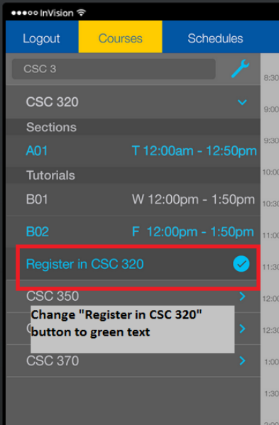
- Change colour of Register in CSC 320 to a different colour so user recognizes it as a button
- Put Register in CSC320 on the bottom of screen with a green font.
- Register Selected Courses is very dim and hard to read when greyed out
What would have made the Schedule Menu easier to use?
- Make a friend request section to keep friend requests separate from friends
- Use a popup message to alert user of friend request
- Tell the user what the checkmarks do so the user does not have to guess
What would have made the Courses Menu easier to use?
- Use a different icon. Some may think that the sync button is a logout button
- Let the user sync to google calendar from the schedules menu
- Let user enter both email and password on popup so there is less tapping
- Change the export button to a button that displays Share
Why did you tap the “Back to Courses” button instead of “Register in CSC 320” button?
- Was not aware that there was a register button on that screen
- Register in CSC 320 button did not look like a button
- Went back to courses because there was a waitlist and greyed out register button on previous screen
Overall, is the UvicShedule app easy, okay, or hard to figure out
- Easy. App is simple and there is not much to figure out.
- Easy. Simple menus. Don’t have to think too hard.
- Easy. Menus have nice colours.
- Easy. App uses a limited number of colours that work well together.
- Easy. Much easier than MyPage
- Easy. Easy to use and figure out.
- Easy. It was easy to figure out how to do the tasked in the app.
Discussion
From the quantitative data obtained from the usability study, it was found that registering for courses using the UvicSchedule prototype application was significantly faster than using the Uvic MyPage system, and also required less clicks to complete the task. Overall, the participants took less time and less clicks to add courses on the second attempt when adding courses using the UvicSchedule application prototype. Some participants commented that they preferred using the application to add courses over the current MyPage system.
It was found that the application was easily learnable by the participants. On the second attempts, every user was able to improve their time and reach the optimum number of clicks when sharing their schedule and when exporting to google calendar.
The participants of the study found the visual design of the prototype to be appealing. Participants found the application easy to use, simple, and intuitive.
Suggestions
Suggestions on how to improve the user interface were obtained from the questionnaire.
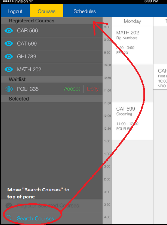
Relocate Search Courses button
Some users found the Search Courses button difficult to locate. A suggested fix was to move the button from the bottom of the courses pane to the top of the pane. This would make the button more visible and easier to find.
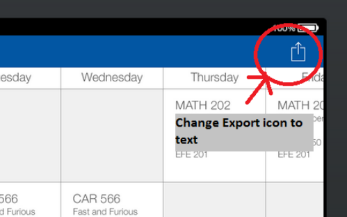
Remove export icon and replace with Export text button
Some users did not recognize the purpose of the export icon. This made it difficult for some users to complete the Export to Google Calendar task in a timely manner. A suggested fix was to replace the icon with an Export button as text.
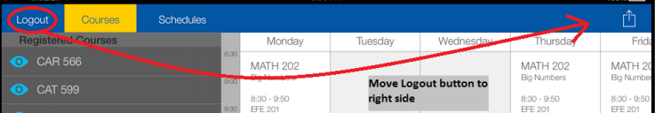
Relocated Logout button from left side to right side of the application
The Logout button can be accidentally selected when tapping the Courses menu, which logs the user out of the application where they must log back in to complete a task. A suggested fix was to move the Logout button to the right side of the application next to the export button to prevent errors. Another suggested fix was to add a confirmation popup when a user selects the logout button.
Change blue Register in CSC 320 button to green
Some users did not recognize the Register in CSC 320 as a button to add courses. Using this button allows a user to add courses faster. A suggested fix was to change the text of the button from blue to green in order to stand out from the other blue text in the courses screen.
Assumptions and Limitations
The participants of this usability study were not randomly selected students. Each participant was an acquaintance of Team DragonSquad. It was assumed that the participants would give honest feedback about the application.
The study was limited to a small number of participants. Since the sample size was small, it is difficult to measure reliable statistics from the data.
Conclusion
Participants found the interface intuitive, easy to use, and learnable. It was found that the application improved on the time it takes to register for courses and was preferred over the Uvic MyPage interface. Useful feedback on how to improve the interface was obtained from the interviews. The usability study for the UvicSchedule application was considered a success, and all objectives were met.
Appendix
Questionnaire
1. What would have made the Courses Menu easier to use?
2. What would have made the Schedule Menu easier to use?
3. What would have made the Sync to Google Calendar task easier?
4. Why did you tap the “Back to Courses” button instead of “Register in CSC 320” button?
5. Overall, is the UvicShedule app easy, okay, or hard to figure out